Tuesday, April 22, 2014

Fiesta Fun


Target Audience- Families with children 14 and younger.
Cognitive- Family Friendly, Fun, Convenient, Affordable, Entertainment
Emotion-Happy,Excited,
Practicality-Entertainment for all ages.
Fun & Utility
Message-Where the FUN never sets.
Need-Party place, Entertainment morning, afternoon, evening
How to get it out there

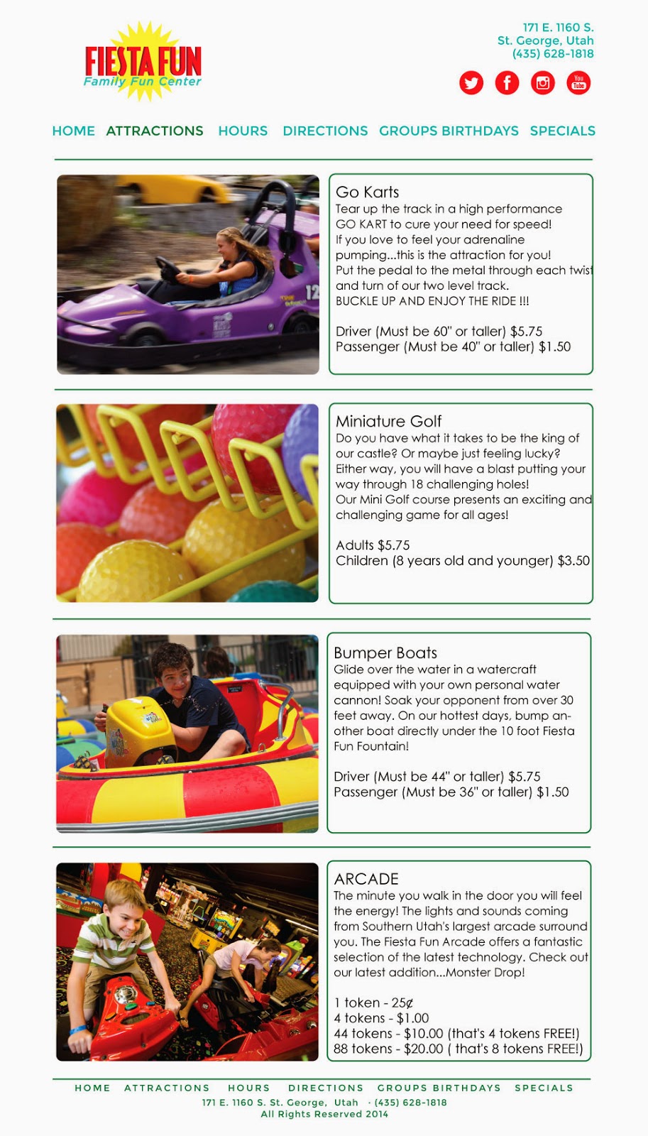
I was in charge of working on the website. The old website was full of masked photos and out of date colors with bad text alignment. When designing the website I stayed with the style guide and tried to make the new site simple with the focus of minimal photos that are bright and fun. I wanted the information to be simple, clean, and easy to find. The Law of Similarity and Law of Proximity were used in the design of this webpage to help the flow of the page.

Monday, March 31, 2014

The Secret Life of Walter Mitty Cinematography and Special Effects


Rule of Thirds
The Cinematography by Stuart Dryburgh

Throughout the whole movie the movie crew did a fantastic job at filming each scene thinking and applying the proper techniques of the rule of thirds. They filmed this scene that our group chose high on mountain tops and rugged terrain. The background on the hike with the hikers had a good balance of beauty and ruggedness. For example, in one scene, Walter Mitty is walking through a valley of snow on the bottom of the screen and on the top third is the mountain horizons. It shows balance, beauty, and loneliness.


 Special Effects
     James R. Bilz
As a graphic design major, I thought it was very interesting how they used the negative space in different scenes to have Walter Mitty's journal entries appear and disappear as he is hiking through the mountains. I liked that it was not just words but that it was handwritten with lines similar to that of a journal. The placement of the journal entries were placed with the snow/rushing water like white paper. It gave a great narrative to the scenes and how he would feel. For example, there was one part where he felt like he was alone and all of the words disappeared except for the word "alone." This special effect allowed the viewers eye to bounce around the screen in a visually appealing way.


 Another Special Effects was replacing backgrounds with appropriate Nepalese imagery using supplied reference and real photographs taken by one of their own artists. “Something that was very successful was not only replacing the backgrounds,” says Rocheron, “but also we tweaked the foregrounds on which Walter is walking. We added cliffs, or little chunks he was walking on, to make them steeper. It was a subtle manipulation to show he was always climbing those mountains and that it was somehow a very hostile environment.” 

Wednesday, March 5, 2014

Compose Your Frame


Today marks one month of my son's life on Earth. This photo's main focus, like many portrait photos, is his eyes which were strategically placed in the top left third of the photo frame. His head is tilted with his eyes looking toward the bottom right corner which is opposite of the focus. The ground, which is the rippling blanket that Ezra is laying on, is very simple and doesn't take away from the image or make it busy but there is enough contrast to keep it interesting. The light in this photo comes across the image on a diagonal line, contrasting lights on his face with the shadows on his back and illuminating his face making the image more appealing.

Monday, March 3, 2014

Axioms of Web Design


Sports Illustrated's webpage is an ever-changing website with sports updates of news and scores. There is a lot of information compacted into one homepage for the viewer to chose what to look at or read about. The webpage is designed to be broken into different categories so that the viewer can navigate with ease to their desired location. They accomplish this by margins between each category and using sizes of the images of titles by important to least important. For example, when I first got to this website there was a picture of LeBron James flying through the sky with a report of him scoring a career high of 61 points. Another way that this page is designed well is the navigation bar is fashioned after an old-school banner. This small detail is aesthetically pleasing to the eye and draws the viewer to where they need to be in order to navigate. Another goal for a webpage is to have returning visitors. They accomplish this by having current scores at the top of the page allowing fans to be updated quickly and easily. This website is also converted to fit on a cell phone browser by converting the sports reports into smaller rows and columns that is easy to navigate as well. This website is well designed for all the information that is compacted and is easy to navigate.  

Thursday, February 13, 2014

fonts


To me, this is a great example of font combinations working together. I believe the words "pray for the" is the font Dobra-Slab. I don't know what font that "stars" is but the font combinations have a good contrast. I love that the words "for the" are on top of each other and are the same size as the baseline and cap height of the word "pray." The size of the words have a lot of meaning showing their importance. The word "stars" grabs your attention and pulls your focus to it. The cursive font also reminds me of outer space and the milky way with its smooth curved strokes. I think the designer did a great job with the font combinations.

Friday, February 7, 2014

good and bad design

Bad Design

Dixie State North Plaza
        This building is where most of the art classes take place at Dixie State. It used to be an old Harmon's grocery store a long time ago and then Dixie took over and it appears that they haven't changed the appearance. The whole building has plain white walls and cheap flooring and not one of the classrooms has a window. This is where students are expected to be creative. There is no thought or design put into this building and nothing to be proud of inside or out. 


 Good Design
This is the campus of UVU in Provo, Utah where most of their art classes are held. They have a similar story where they inherited an old building for the use of art classes. The building used to be an old gym but unlike Dixie they designed it to look like art classrooms. For example, if you look at the air vents, they painted them in bright colors. Painting the vents, to me, shows texture and contrast. Also, the classrooms are large and have windows to expand the creative mind. Classrooms have storage cubbies to save space and to store the artwork. UVU took something old and dirty and changed it for the better. 


Wednesday, January 22, 2014

Contrast, Balance, Harmony

This is a picture of my son Benny and pregnant wife Megan playing in front of a window in our living room. The picture was taken a few weeks ago on a cloudy Saturday afternoon. The absence of light inside the house creates a silhouette around the two bodies and a frame around the windowsill. The dark contrast between inside and outside gives the image a dramatic surrounding. The focus of the image is Benny's hand reaching upward pointing to his mother's stomach. The hand is highlighted by the background but not so much that it is all you look at. The angle that the picture was taken was not straight on, expressing the candidness of the moment. The texture in this photo is unique because the light meter was taken on the background but the focus is on the two individuals, thus reversing the roles.

This photo captures the bittersweet feeling of having a second child. My wife is excited for the future but sad at the same time to be losing the life she has had with just she and her firstborn. It also captures the innocence of our young child acknowledging the existence of a baby but not comprehending how his life is about to change.

Tuesday, January 14, 2014

Visceral Response

Ever since I was around 12 years old I have been obsessed with classic cars.  My favorite car that makes me stop in my tracks to this day is the 1964 1/2 to 1966 Ford Mustang.  These years are first years of the Ford Mustang lines.  I think they did an amazing job designing an affordable muscle car for the American people.  I have owned three of these cars, two 1965's and one 1966.  I have done all of the work myself, including painting my first one three different times.  The design of the body lines never get old to me.  For example, on the side of the quarter panel there is an indented side scoop which creates a body line that runs horizontally down the whole side of the Mustang.  This body line is an example of form and function that creates strength in the sheet metal, protecting it against dents.  It also draws the eye of the viewer of the car to move the eyes across the whole car.  It also gives a reflection of the color of the car to show off the depth of the color of the car in different light tones.  

Between the front of the hood to the firewall (divider between engine and cab) is a perfect amount of space to have a V8 engine so that it is a true muscle car.  If the hood was shorter it would look like a compact car and lose all respect as a muscle car.  Another design element is a slight lift in the quarter panel over the back wheel creating speed while the car is standing still.  I think this is one of America's best car designs and the numbers don't lie.  This is one of the best selling cars in the history of American automobiles.